# 文本组件
# Text
Text组件,顾名思义,是一个最基础的显示文本的组件。
Text("Hello Flutter");
# 1. 必传的位置参数
在Text组件的默认构造函数种有一个必须传的位置参数(也称作非命名参数),必须作为第1个参数传入。其内容就是需要显示的文本,类型是String。
这里需要显示的文本字符串可以是空字符(""),但不可以为空值(null)。
Text组件还有一个非常好用的构造函数,Text.rich()可以用于在一段文字之间切换样式。使用这个构造函数时,必传的位置参数则不是需要显示的字符串,而是一个TextSpan类。TextSpan类除了可以通过text属性传入字符串外,还可以通过style属性自定义文字样式,甚至可以再通过children属性嵌套另一个TTextSpan列表,以达成叠加文字样式的目的。
# 2. style属性
Text组件的默认样式是由上级DefaultTextStyle(默认文本样式组件)继承而来。
如果需要修改样式,则可以通过style参数传入一个TextStyle类型的值。Text组件在渲染时,会自动将style参数种的样式与上级提供的样式合并。
| 名称 | 说明 |
|---|---|
| inherit | 是否继承父类组件属性,默认true |
| color | 字体颜色 |
| fontSize | 文字大小,默认14px |
| fontWeight | 字体粗细 |
| fontStyle | 字体样式,normal或italic |
| letterSpacing | 字母间距,默认为0,负数间距缩小,正数间距增大 |
| wordSpacing | 单词间距,默认为0,负数间距缩小,正数间距增大 |
| textBaseline | 字体基线 |
| height | 行高 |
| locale | 设置区域 |
| foreground | 前景色 |
| background | 背景色 |
| shadows | 阴影 |
| decoration | 文字划线,下换线等等装饰 |
| decorationColor | 划线颜色 |
| decorationStyle | 划线样式,虚线、实线等样式 |
| debugLabel | 描述信息 |
| fontFamily | 字体 |
| fontFamilyFallback | 备用字体 |
| package | 用于指定字体资源所在的包 |
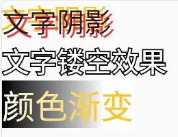
class CustomWidget extends StatelessWidget {
const CustomWidget({super.key});
Widget build(BuildContext context) {
return Column(
crossAxisAlignment: CrossAxisAlignment.start,
children: [
const Text(
"文字阴影",
style: TextStyle(
fontSize: 40,
shadows: [
BoxShadow(
offset: Offset(-5, -5),
color: Colors.amber,
),
BoxShadow(
offset: Offset(5, 5),
color: Colors.red,
)
],
),
),
Stack(
children: [
Text(
'文字镂空效果',
style: TextStyle(
fontSize: 40,
foreground: Paint()
..style = PaintingStyle.stroke
..strokeWidth = 4
..color = Colors.black,
),
),
const Text(
'文字镂空效果',
style: TextStyle(
fontSize: 40,
color: Colors.white,
),
),
],
),
Text(
"颜色渐变",
style: TextStyle(
fontSize: 48,
background: Paint()
..shader = ui.Gradient.linear(
const Offset(0, 0),
const Offset(150, 0),
[Colors.black, Colors.white],
),
foreground: Paint()
..shader = ui.Gradient.linear(
const Offset(150, 0),
const Offset(0, 0),
[Colors.amber, Colors.white],
),
),
),
],
);
}
}
2
3
4
5
6
7
8
9
10
11
12
13
14
15
16
17
18
19
20
21
22
23
24
25
26
27
28
29
30
31
32
33
34
35
36
37
38
39
40
41
42
43
44
45
46
47
48
49
50
51
52
53
54
55
56
57
58
59
60
61
62
63
64
65
66
67
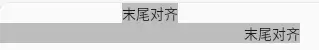
# 3. textAlign 和 textDirection
因为文字的对齐不属于文本渲染样式,而是属于排版方式,所以不是通过style属性设置,而是通过textAlign属性设置。
| 名称 | 说明 |
|---|---|
| textAlign | 对齐方式 |
| textDirection | 阅读方式 |
textAlign用于设置文本在Text组件内的对齐方式,而不是Text组件本身在其父级组件中的对齐方式。
class CustomWidget extends StatelessWidget {
const CustomWidget({super.key});
Widget build(BuildContext context) {
return Column(
children: [
Container(
color: Colors.grey[400],
child: const Text(
"末尾对齐",
textAlign: TextAlign.end,
),
),
Container(
color: Colors.grey[400],
width: 300, // 影响Text组件尺寸
child: const Text(
"末尾对齐",
textAlign: TextAlign.end,
),
)
],
);
}
}
2
3
4
5
6
7
8
9
10
11
12
13
14
15
16
17
18
19
20
21
22
23
24
25
26
# 4. maxLines 和 softWrap
| 名称 | 说明 |
|---|---|
| softWrap | 自动换行,默认true |
| maxLines | 最多显示几行,类型为整数 |
# 5. overflow
当文本较长,且不需要渲染全部内容时,可用 overflow属性这是超出部分该如何处理。
可传入的参数为TextOverflow
| 名称 | 说明 |
|---|---|
| clip | 裁剪 |
| fade | 渐淡 |
| ellipsis | 省略号 |
| visible | 可见 |
当
overflow参数被设置为TextOverflow.ellipsis(省略号)时,即使没有特别传入maxLines规定的最大行数,也没有关闭softWrap自动换行,Text组件默认仍然只会显示一行,而不会自动换行。
# 6.textScaleFactor
文字缩放系数,可以接收一个小数类型,并在Text组件渲染文本时将style参数里设置的字号数值(或默认的字号数值14)与该系数相乘。
textScaleFactor的默认值并不总是1.0,是操作系统层级的缩放比例。比如老年模式下全局文字的150%,textScaleFactor的默认值就是1.5。
# 7. semanticsLabel
语义标签是辅助功能的一部分,用来协助第三方软件为有障碍人士提供无障碍服务。
Text("¥5.00",semanticsLabel:"五元整");
# DefaultTextStyle
Text组件的默认样式是由上级DefaultTextStyle(默认文本样式)继承而来。
# 1. 基础参数和用法
DefaultTextStyle组件的参数和Text组件非常相似。与Text组件不同的是,DefaultTextStyle不支持直接传入文本内容,而是支持child参数,可供传入一个任意组件。
# 2. 合并与继承
Text组件的默认样式是由最临近的上级DefaultTextStyle组件所提供,因此当遇到多个DefaultTextStyle组件嵌套时,只有最近的那个样式会生效。
如需要新的DefaultTextStyle组件继承上级已有的默认样式,则可以借助DefaultTextStyle.merge()构造函数进行合并操作,而不是重新开始。
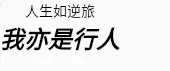
class CustomWidget extends StatelessWidget {
const CustomWidget({super.key});
Widget build(BuildContext context) {
return DefaultTextStyle(
style: const TextStyle(
color: Colors.red,
fontSize: 24,
fontWeight: FontWeight.bold,
fontStyle: FontStyle.italic,
),
child: Column(
children: [
const DefaultTextStyle(
style: TextStyle(
color: Colors.black,
),
child: Text("人生如逆旅"),
),
DefaultTextStyle.merge(
style: const TextStyle(
color: Colors.black,
),
child: const Text("我亦是行人"),
)
],
),
);
}
}
2
3
4
5
6
7
8
9
10
11
12
13
14
15
16
17
18
19
20
21
22
23
24
25
26
27
28
29
30
31
# 3. 动画效果
若需要在程序运行时做出文本样式的渐变动画效果,则可以考虑使用该组件的动画版: AnimatedDefaultTextStyle组件。
相对于DefaultTextStyle组件,AnimatedDefaultTextStyle组件会多出以下参数
| 名称 | 说明 |
|---|---|
| duration | Duration 类型,指定动画的持续时间 |
| curve | Curve 类型,用于指定动画的曲线,即动画的速度变化 |
| onEnd | VoidCallback 类型,是一个回调函数,每当动画完成时被调用 |
# RichText
RichText组件可以用来显示一段包含不同样式的文本。
# 1. text属性
RichText组件中需要显示的文本内容由text属性设置。不同于Text组件,这里RichText组件需要传入的文本信息不是简单的字符串(String)类型,而是TextSpan类型。
TextSpan类型本身是一种可以无限递归的树状结构。
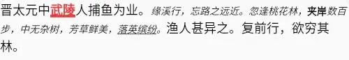
class CustomWidget extends StatelessWidget {
const CustomWidget({super.key});
Widget build(BuildContext context) {
return RichText(
text: const TextSpan(
style: TextStyle(
fontSize: 18,
color: Colors.black,
),
text: "晋太元中",
children: [
TextSpan(
text: "武陵",
style: TextStyle(
color: Colors.red,
fontWeight: FontWeight.bold,
decoration: TextDecoration.underline,
decorationThickness: 4,
),
),
TextSpan(text: "人捕鱼为业。"),
TextSpan(
style: TextStyle(
fontStyle: FontStyle.italic,
fontSize: 14,
),
text: "缘溪行,忘路之远近。",
children: [
TextSpan(text: "忽逢桃花林,"),
TextSpan(
style: TextStyle(
fontStyle: FontStyle.normal,
fontWeight: FontWeight.w900,
),
text: "夹岸",
),
TextSpan(text: "数百步,中无杂树,芳草鲜美,"),
TextSpan(
style: TextStyle(
decoration: TextDecoration.underline,
decorationStyle: TextDecorationStyle.wavy,
),
text: "落英缤纷",
),
TextSpan(text: "。"),
],
),
TextSpan(text: "渔人甚异之。复前行,欲穷其林。"),
],
),
);
}
}
2
3
4
5
6
7
8
9
10
11
12
13
14
15
16
17
18
19
20
21
22
23
24
25
26
27
28
29
30
31
32
33
34
35
36
37
38
39
40
41
42
43
44
45
46
47
48
49
50
51
52
53
54
55
# 2. Text组件的Text.rich()构造函数
Text.rich()和RichText用法大同小异。
区别在于
Text.rich()继承上级DefaultTextStyle组件提供的默认样式RichText不继承上级DefaultTextStyle组件提供的默认样式
# 3. 其他属性
除了text属性外,RichText组件还同样支持Text组件的部分其他属性。
# 4. 触碰检测
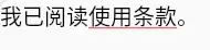
TextSpan中的recognizer参数支持传入一个GestureRecognizer类以便完成TextSpan树中某一片段的检测。
class CustomWidget extends StatelessWidget {
const CustomWidget({super.key});
Widget build(BuildContext context) {
return RichText(
text: TextSpan(
style: const TextStyle(fontSize: 20),
children: [
const TextSpan(text: "我已阅读"),
TextSpan(
style: const TextStyle(
decoration: TextDecoration.underline,
decorationColor: Colors.red,
),
text: "使用条款",
recognizer: TapGestureRecognizer()
..onTap = () => print("检测到用户单机使用条款"),
),
const TextSpan(text: "。"),
],
),
);
}
}
2
3
4
5
6
7
8
9
10
11
12
13
14
15
16
17
18
19
20
21
22
23
24
25