# 按钮组件
# 常用按钮
最常用的按钮主要是ElevateButton和TextButton这两个组件,还有用于渲染符合iOS风格的CupertinoButton组件。
# ElevatedButton
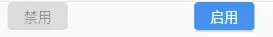
凸起按钮属于Material风格按钮。按钮组件可通过child属性接收一个用于渲染的子组件,以及通过可选的onPressed或onLongPress属性接受回传函数,分别在用户点击与长按时触发。若这2个回传函数都为null,则按钮会自动变成“禁用”状态,即呈现出灰色的视觉效果且不接受用户单机。
class CustomWidget extends StatelessWidget {
const CustomWidget({super.key});
Widget build(BuildContext context) {
return Row(
mainAxisAlignment: MainAxisAlignment.spaceEvenly,
children: [
const ElevatedButton(
onPressed: null,
child: Text("禁用"),
),
ElevatedButton(
onPressed: () => print("用户单机了按钮"),
onLongPress: () => print("用户长按了按钮"),
onHover: (isHovering) {
if (isHovering) {
print("鼠标悬停时");
} else {
print("鼠标离开时");
}
},
onFocusChange: (hasFocus) {
if (hasFocus) {
print("钮获得焦点时");
} else {
print("按钮失去焦点时");
}
},
child: Text("启用"),
),
],
);
}
}
2
3
4
5
6
7
8
9
10
11
12
13
14
15
16
17
18
19
20
21
22
23
24
25
26
27
28
29
30
31
32
33
34
35
# 1. 图标按钮
除了普通的构造函数外,凸起组件还提供ElevatedButton.icon()命名构造函数。
class CustomWidget extends StatelessWidget {
const CustomWidget({super.key});
Widget build(BuildContext context) {
return Row(
mainAxisAlignment: MainAxisAlignment.spaceEvenly,
children: [
ElevatedButton.icon(
onPressed: () => print("用户单机了按钮"),
label: const Text("默认Icon左"),
icon: const Icon(Icons.star),
),
Directionality(
textDirection: TextDirection.rtl,
child: ElevatedButton.icon(
onPressed: () => print("用户单机了按钮"),
icon: const Icon(Icons.star),
label: const Text("改变文字方向性"),
),
),
],
);
}
}
2
3
4
5
6
7
8
9
10
11
12
13
14
15
16
17
18
19
20
21
22
23
24
25

这里的
icon和label属性并不一定要求传入相应的Icon组件和Text组件。实际上,ElevatedButton.icon函数背后的工作原理也只是简单地将icon和label嵌入Row容器中,并在二者之间插入一个宽度为8单位的SizedBox组件以留白。
Row(
    mainAxisSize: MainAxisSize.min,
    children:[icon, SizeBox(width: gap), label],
)
2
3
4
# 2. style
在Flutter中,ButtonStyle和ElevatedButton.styleFrom都是用来定制按钮样式的工具,但它们属于不同的概念和使用场景。
ButtonStyle是一个类,提供了广泛的样式属性,可以应用于多种按钮类型。ElevatedButton.styleFrom是一个便捷方法,专门用于快速设置ElevatedButton的样式,返回一个ButtonStyle对象。
在实际开发中,你可以根据需要选择使用ButtonStyle来精细控制样式,或者使用ElevatedButton.styleFrom来快速设置ElevatedButton的样式。
# ButtonStyle
ElevateButton组件的外观样式可通过向style参数传入ButtonStyle定制,而ButtonStyle类的构造函数支持大量参数,可以设置不同状态下的字体、颜色、凸起高度甚至按钮图形等。
# 1. MaterialStateProperty
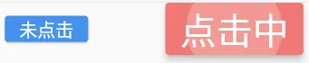
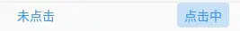
ButtonStyle中有不少受到交互状态影响的属性,这些属性就需要接收一个名为MaterialStateProperty的类型,以便在不同的MaterialState下分别指定不同值。这里的MaterialState是指按钮的交互状态,如pressed(被按下)、focused(有焦点)、dragged(被拖动)、disabled(禁用)等。ButtonStyle属性接收了MaterialStateProperty类,就可以自动根据当前的交互状态采用对应的属性值。
实战中,推荐使用MaterialStateProperty.resolveWith()方法,判断传入的合集(Set数据结构)中是否含有特定的交互状态,并依此返回相应的属性值。
class CustomWidget extends StatelessWidget {
const CustomWidget({super.key});
Widget build(BuildContext context) {
return Row(
mainAxisAlignment: MainAxisAlignment.spaceEvenly,
children: [
ElevatedButton(
onPressed: () => print("用户单机了按钮"),
style: ButtonStyle(
backgroundColor: MaterialStateProperty.resolveWith(
(states) {
print("states ${states}");
// 若按钮处于被单击的状态,则返回红色,否则返回蓝色
if (states.contains(MaterialState.pressed)) {
return Colors.red;
}
return Colors.blue;
},
),
textStyle: MaterialStateProperty.resolveWith(
(states) {
print("states ${states}");
// 若按钮处于被单击的状态,则返回40字号,否则返回20字号
if (states.contains(MaterialState.pressed)) {
return const TextStyle(fontSize: 40);
}
return const TextStyle(fontSize: 20);
},
),
),
child: const Text("未点击"),
),
ElevatedButton(
onPressed: () => print("用户单机了按钮"),
style: ButtonStyle(
backgroundColor: MaterialStateProperty.resolveWith(
(states) {
print("states ${states}");
// 若按钮处于被单击的状态,则返回红色,否则返回蓝色
if (states.contains(MaterialState.pressed)) {
return Colors.red;
}
return Colors.blue;
},
),
textStyle: MaterialStateProperty.resolveWith(
(states) {
print("states ${states}");
// 若按钮处于被单击的状态,则返回40字号,否则返回20字号
if (states.contains(MaterialState.pressed)) {
return const TextStyle(fontSize: 40);
}
return const TextStyle(fontSize: 20);
},
),
),
child: const Text("点击中"),
),
],
);
}
}
2
3
4
5
6
7
8
9
10
11
12
13
14
15
16
17
18
19
20
21
22
23
24
25
26
27
28
29
30
31
32
33
34
35
36
37
38
39
40
41
42
43
44
45
46
47
48
49
50
51
52
53
54
55
56
57
58
59
60
61
62
63
64
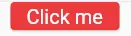
若无须单独对各种互交状态设置不同的值,则可以通过MaterialStateProperty.all()方法统一设置所有交互状态。
class CustomWidget extends StatelessWidget {
const CustomWidget({super.key});
Widget build(BuildContext context) {
return Row(
mainAxisAlignment: MainAxisAlignment.spaceEvenly,
children: [
ElevatedButton(
onPressed: () => print("用户单机了按钮"),
style: ButtonStyle(
backgroundColor: MaterialStateProperty.all(Colors.red),
textStyle: MaterialStateProperty.all(const TextStyle(fontSize: 20)),
),
child: const Text("Click me"),
),
],
);
}
}
2
3
4
5
6
7
8
9
10
11
12
13
14
15
16
17
18
19
20
# 2. 其他样式属性
ButtonStyle中也有不受交互状态影响的属性,也就不需要传入MaterialStateProperty的类。
| 名称 | 说明 |
|---|---|
| visualDensity | 定义按钮的视觉密度,这是一个非交互状态的属性,用于调整按钮的紧凑程度。 |
| tapTargetSize | 定义按钮的响应触摸区域大小,这也是一个静态属性,不随交互状态改变。 |
| animationDuration | 定义按钮动画的持续时间,这是一个静态值,不依赖于按钮的状态。 |
| enableFeedback | 定义按钮是否启用反馈,如长按震动,这是一个布尔值,不随交互状态变化。 |
| alignment | 定义按钮子组件的对齐方式,这是一个静态属性,不随交互状态改变。 |
| splashFactory | 定义按钮按下时的水波纹效果,虽然它与交互有关,但通常设置为一个固定的工厂类,而不是基于状态的属性。 |
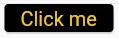
# ElevatedButton.styleFrom
ElevatedButton.styleFrom是ElevatedButton类的一个便捷方法,它允许你快速设置ElevatedButton的样式属性。这个方法返回一个ButtonStyle对象,你可以使用它来设置ElevatedButton的样式。
大部分ButtonStyle的属性都可以通过这种方式直接传入,而styleFrom方法的内部实际上还会调用MaterialStateProperty.all,将传入的值应用于所有交互状态。
class CustomWidget extends StatelessWidget {
const CustomWidget({super.key});
Widget build(BuildContext context) {
return Row(
mainAxisAlignment: MainAxisAlignment.spaceEvenly,
children: [
ElevatedButton(
onPressed: () => print("用户单机了按钮"),
style: ElevatedButton.styleFrom(
textStyle: const TextStyle(fontSize: 20),
foregroundColor: Colors.amber,
backgroundColor: Colors.black,
),
child: const Text("Click me"),
),
],
);
}
}
2
3
4
5
6
7
8
9
10
11
12
13
14
15
16
17
18
19
20
21
# TextButton
TextButton组件是一个符合Material设计风格的扁平按钮,常用于工具栏或菜单栏中,避免由多个凸起按钮的边框与阴影造成的视觉拥挤。
# 1. 基础用法
使用TextButton组件时一般通过child属性传入一个Text组件,再通过onPressed或onLongPress回传函数监听按钮的单击或长按事件。在没有被单击时,扁平按钮在视觉上与Text组件除默认颜色外并无差异,但当用户按下按钮时则会出现填充色及水波纹效果。
class CustomWidget extends StatelessWidget {
const CustomWidget({super.key});
Widget build(BuildContext context) {
return Row(
mainAxisAlignment: MainAxisAlignment.spaceEvenly,
children: [
TextButton(
onPressed: () => print("用户单机了按钮"),
child: const Text("未点击"),
),
TextButton(
onPressed: () => print("用户单机了按钮"),
child: const Text("点击中"),
),
],
);
}
}
2
3
4
5
6
7
8
9
10
11
12
13
14
15
16
17
18
19
20
# 2. style
在Flutter中,ButtonStyle和TextButton.styleFrom都是用来定制按钮样式的工具,但它们属于不同的概念和使用场景。
ButtonStyle是一个类,提供了广泛的样式属性,可以应用于多种按钮类型。TextButton.styleFrom是一个便捷方法,专门用于快速设置TextButton的样式,返回一个ButtonStyle对象。
在实际开发中,你可以根据需要选择使用ButtonStyle来精细控制样式,或者使用TextButton.styleFrom来快速设置TextButton的样式。
使用方法同上面的点击跳转
# CupertinoButton
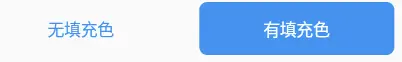
CupertinoButton是Flutter中用于创建 iOS 风格按钮的组件。它提供CupertinoButton()和CupertinoButton.filled()这2种构造函数,分别对应无填充与有填充色的按钮。
class CustomWidget extends StatelessWidget {
const CustomWidget({super.key});
Widget build(BuildContext context) {
return Row(
mainAxisAlignment: MainAxisAlignment.spaceEvenly,
children: [
CupertinoButton(
onPressed: () => print("用户单机了按钮"),
child: const Text("无填充色"),
),
CupertinoButton.filled(
onPressed: () => print("用户单机了按钮"),
child: const Text("有填充色"),
),
],
);
}
}
2
3
4
5
6
7
8
9
10
11
12
13
14
15
16
17
18
19
20
该按钮不支持长按,因此无论用户按下按钮后保持多久,松开后都会触发
onPressed回传函数。
# 常用属性
| 名称 | 说明 |
|---|---|
| child | 按钮中显示的 widget,可以是文本、图标或其他 widget。 |
| padding | 按钮的内边距。 |
| color | 按钮的背景颜色。 |
| disabledColor | 按钮禁用时的背景颜色,默认为CupertinoColors.quaternarySystemFill。 |
| minSize | 按钮的最小尺寸,默认为kMinInteractiveDimensionCupertino。 |
| pressedOpacity | 按压下去时按钮的透明度,默认为 0.4。 |
| borderRadius | 按钮圆角的大小,默认为const BorderRadius.all(Radius.circular(8.0))。 |
| alignment | 按钮子组件的对齐方式。 |
| focusColor | 键盘交互时的焦点高亮颜色。 |
| focusNode | 一个可选的焦点节点,用作该 widget 的焦点节点。 |
| autofocus | 一个布尔值,表示当其范围内没有其他节点当前被聚焦时,该 widget 是否会被选为初始焦点。 |