# 弹性布局
弹性布局允许子组件按照一定比例来分配父容器空间。
https://api.flutter.dev/flutter/widgets/Flex-class.html (opens new window)
# Flex
实际上Row和Column组件都是继承于Flex组件,主要用于增强代码的可读性,类似于语法糖的作用。
Flex组件的用法与Row或Column几乎一致,但需要额外传入direction(方向)参数,以便指定Flex的主轴方向。
- direction: Axis.horizontal 表示认定水平方向为主轴 - Row组件效果
- direction: Axis.vertical 表示认定垂直方向为主轴 - Column组件效果
# Expanded
当使用Flex组件布局时(包括Row和Column组件),通过给子组件嵌套Expanded组件,可以"扩张"那些子组件,使它们占满Flex的剩余全部可用空间。
class CustomWidget extends StatelessWidget {
const CustomWidget({super.key});
Widget build(BuildContext context) {
return Row(
children: [
const FlutterLogo(
size: 100,
),
Expanded(
child: Container(
height: 100,
color: Colors.grey[400],
alignment: Alignment.center,
child: const Text("这个部分是Expanded区域"),
),
),
const FlutterLogo(
size: 100,
),
],
);
}
}
1
2
3
4
5
6
7
8
9
10
11
12
13
14
15
16
17
18
19
20
21
22
23
24
25
2
3
4
5
6
7
8
9
10
11
12
13
14
15
16
17
18
19
20
21
22
23
24
25
运行时,Flex会首先将固定尺寸的普通组件摆放到位,在计算剩余空间,并分配给不固定尺寸的“弹性”组件。

Expanded组件的flex属性可以接受一个整数,用于表示该组件相对于其他弹性组件的“弹性权重”,默认为1。若将flex设置为0或者null,则表示该组件没有弹性,应该被当作普通的固定尺寸的子组件处理。其余情况下,它会被当作有弹性的组件,将按照flex属性值的权重,参与Flex剩余空间的分配。
class CustomWidget extends StatelessWidget {
const CustomWidget({super.key});
Widget build(BuildContext context) {
return Row(
children: [
Expanded(
flex: 1,
child: Container(
height: 100,
color: Colors.black12,
),
),
Expanded(
flex: 2,
child: Container(
height: 100,
color: Colors.black26,
),
),
Expanded(
flex: 3,
child: Container(
height: 100,
color: Colors.black38,
),
),
],
);
}
}
1
2
3
4
5
6
7
8
9
10
11
12
13
14
15
16
17
18
19
20
21
22
23
24
25
26
27
28
29
30
31
32
2
3
4
5
6
7
8
9
10
11
12
13
14
15
16
17
18
19
20
21
22
23
24
25
26
27
28
29
30
31
32

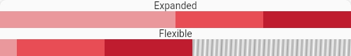
# Flexible
Flexible是Expanded组件的父类,主要作用也是用于“扩张”Flex中的部分组件,使它们占满全部空间。
Flexible可以通过fit属性设置其child是否必须占满Flexible为其扩张的空间,其默认值是FlexFit.loose。
- fit: FlexFit.tight 紧约束,强制约束子组件的尺寸必须为Flexible分配的尺寸,不可以更大或者更小 -
Expanded组件效果 - fit: FlexFit.loose 松约束,允许子组件的尺寸小于或等于所分配的尺寸。此时,若某些子组件真的选择渲染更小的尺寸,则它们节约出的多余空间也不会再被分配给其他组件。
class CustomWidget extends StatelessWidget {
const CustomWidget({super.key});
Widget build(BuildContext context) {
return Column(
crossAxisAlignment: CrossAxisAlignment.stretch,
children: [
const Text(
"Expanded",
textAlign: TextAlign.center,
),
Container(
decoration: BoxDecoration(
gradient: LinearGradient(
begin: Alignment.topLeft,
end: Alignment.bottomRight,
colors: List.generate(
150,
(index) => index % 2 == 0 ? Colors.grey : Colors.white,
),
),
),
child: Row(
children: [
Expanded(
flex: 2,
child: Container(
width: 24,
height: 24,
color: Colors.red[200],
),
),
Expanded(
flex: 1,
child: Container(
width: 24,
height: 24,
color: Colors.red[400],
),
),
Expanded(
flex: 1,
child: Container(
width: 24,
height: 24,
color: Colors.red[800],
),
),
],
),
),
const Text(
"Flexible",
textAlign: TextAlign.center,
),
Container(
decoration: BoxDecoration(
gradient: LinearGradient(
begin: Alignment.topLeft,
end: Alignment.bottomRight,
colors: List.generate(
150,
(index) => index % 2 == 0 ? Colors.grey : Colors.white,
),
),
),
child: Row(
children: [
Flexible(
flex: 2,
child: Container(
width: 24,
height: 24,
color: Colors.red[200],
),
),
Expanded(
flex: 1,
child: Container(
width: 24,
height: 24,
color: Colors.red[400],
),
),
Expanded(
flex: 1,
child: Container(
width: 24,
height: 24,
color: Colors.red[800],
),
),
],
),
),
],
);
}
}
1
2
3
4
5
6
7
8
9
10
11
12
13
14
15
16
17
18
19
20
21
22
23
24
25
26
27
28
29
30
31
32
33
34
35
36
37
38
39
40
41
42
43
44
45
46
47
48
49
50
51
52
53
54
55
56
57
58
59
60
61
62
63
64
65
66
67
68
69
70
71
72
73
74
75
76
77
78
79
80
81
82
83
84
85
86
87
88
89
90
91
92
93
94
95
96
97
98
99
100
2
3
4
5
6
7
8
9
10
11
12
13
14
15
16
17
18
19
20
21
22
23
24
25
26
27
28
29
30
31
32
33
34
35
36
37
38
39
40
41
42
43
44
45
46
47
48
49
50
51
52
53
54
55
56
57
58
59
60
61
62
63
64
65
66
67
68
69
70
71
72
73
74
75
76
77
78
79
80
81
82
83
84
85
86
87
88
89
90
91
92
93
94
95
96
97
98
99
100
设置3个子组件的比例为2:1:1。设置Row容器背景为虚线格子。
- 若第一个子组件使用
Expanded强制约束尺寸,它就一定会占满Row的总宽度一半 - 若第一个子组件使用
Flexible放松约束,且它自身尺寸设置了更小的宽度时,Row容器就不一定会被谈满。
# Spacer
英文Space是空白的意思,因此Spacer是一个用于在Flex中弹性留白的组件。它没有child参数,但有flex参数,用于表示该组件相对于其他弹性组件的“弹性权重”。
class CustomWidget extends StatelessWidget {
const CustomWidget({super.key});
Widget build(BuildContext context) {
return Container(
color: Colors.amber,
child: Row(
children: [
const Spacer(
flex: 1,
),
Expanded(
flex: 0,
child: Container(
width: 100,
height: 100,
color: Colors.black54,
),
),
],
),
);
}
}
1
2
3
4
5
6
7
8
9
10
11
12
13
14
15
16
17
18
19
20
21
22
23
24
25
2
3
4
5
6
7
8
9
10
11
12
13
14
15
16
17
18
19
20
21
22
23
24
25