# 对齐组件
# Align
Align组件是一个用于对齐和定位子组件的布局小部件。有2种用途:
- 决定其子组件的对齐方式
- 可以把自身尺寸调整到子组件的若干倍
# 对齐方式
aligment参数可以设置子组件的对齐方式,
# Alignment类
Alignment类有两种写法,
- 坐标写法
Alignment(-0.5,1.0) - 内置命名构造函数
Alignment.topLeft;
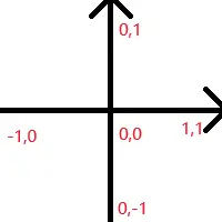
Alignment类构建的坐标系是以组件中心为原点,有横纵两个轴。
- 横轴从左向右,取值范围为[-1.0,1.0]
- 纵轴自下往上,取值范围为[-1.0,1.0]
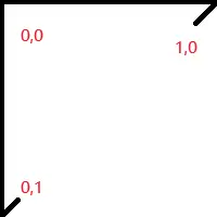
# FractionalOffset类
指定子组件相对于父组件左上角的位置
# 设置自身尺寸
默认情况下,Align组件的自身尺寸会尽量占满父级约束的上限,即越大越好。
若不需要让Align填满父级组件的全部可用空间,则可以利用widthFactor(宽度倍数)和heightFactor(高度倍数)直接将Align自身尺寸设置为子组件的尺寸的倍数。
# 示例
class CustomWidget extends StatelessWidget {
const CustomWidget({super.key});
Widget build(BuildContext context) {
return Container(
color: Colors.black26,
child: Align(
widthFactor: 2,
heightFactor: 2,
alignment: const Alignment(0, 0),
child: Container(
color: Colors.amber,
width: 50,
height: 50,
),
),
);
}
}
1
2
3
4
5
6
7
8
9
10
11
12
13
14
15
16
17
18
19
20
2
3
4
5
6
7
8
9
10
11
12
13
14
15
16
17
18
19
20

# Center
Center 是继承了 Align 对象,默认 alignment=Alignment.center。
Center 定义, 少了一个 alignment 参数
class Center extends Align {
  /// Creates a widget that centers its child.
  const Center({ Key? key, double? widthFactor, double? heightFactor, Widget? child })
    : super(key: key, widthFactor: widthFactor, heightFactor: heightFactor, child: child);
}
1
2
3
4
5
2
3
4
5
然后 Align 定义, 默认了 this.alignment = Alignment.center,
class Align extends SingleChildRenderObjectWidget {
  /// Creates an alignment widget.
  ///
  /// The alignment defaults to [Alignment.center].
  const Align({
    Key? key,
    this.alignment = Alignment.center,
    this.widthFactor,
    this.heightFactor,
    Widget? child,
  }) : assert(alignment != null),
       assert(widthFactor == null || widthFactor >= 0.0),
       assert(heightFactor == null || heightFactor >= 0.0),
       super(key: key, child: child);
1
2
3
4
5
6
7
8
9
10
11
12
13
14
2
3
4
5
6
7
8
9
10
11
12
13
14
Center与Align组件相比,实际上至少了alignment参数,因为它不支持其他的对齐方式,而恰好Align组件不传alignment参数时,其默认行为也是居中,于是代码中出现的所有Center组件均可直接替换为Align组件。