# 图标组件
# Icon
Icon 组件用来显示可缩放的图标,不会像图片一样失真,还能设置颜色。
# 开启
在pubspec.yaml文件里面设置
# The following section is specific to Flutter.
flutter:
  # The following line ensures that the Material Icons font is
  # included with your application, so that you can use the icons in
  # the material Icons class.
  uses-material-design: true
2
3
4
5
6
# icon 预览
安卓风格
https://fonts.google.com/icons?selected=Material+Icons (opens new window)
苹果风格
https://api.flutter.dev/flutter/cupertino/CupertinoIcons-class.html (opens new window)
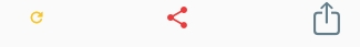
# 1. 基础用法
使用Icon组件时首先要传入一个位置参数,也就是图标数据。
class CustomWidget extends StatelessWidget {
const CustomWidget({super.key});
Widget build(BuildContext context) {
return const Row(
mainAxisAlignment: MainAxisAlignment.spaceEvenly,
children: [
// 安卓风格 icon
Icon(Icons.refresh),
Icon(Icons.share),
// 苹果风格 icon
Icon(CupertinoIcons.share),
],
);
}
}
2
3
4
5
6
7
8
9
10
11
12
13
14
15
16
17

# 2. 可选参数
# a. size 和 color
设置尺寸和颜色
class CustomWidget extends StatelessWidget {
const CustomWidget({super.key});
Widget build(BuildContext context) {
return const Row(
mainAxisAlignment: MainAxisAlignment.spaceEvenly,
children: [
Icon(
Icons.refresh,
size: 16,
color: Colors.amber,
),
Icon(
Icons.share,
size: 24,
color: Colors.red,
),
Icon(
CupertinoIcons.share,
size: 32,
color: Colors.blueGrey,
),
],
);
}
}
2
3
4
5
6
7
8
9
10
11
12
13
14
15
16
17
18
19
20
21
22
23
24
25
26
27
# b. semanticLabel
与Text组件一样,Icon组件也支持semanticLabel属性,用于定义语义标签。这是辅助功能的一部分,用来协助第三方软件为有障碍人士提供无障碍功能。
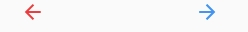
# c. textDirection
textDirection阅读方向。改变阅读方向时,部分图标会发生反转。
class CustomWidget extends StatelessWidget {
const CustomWidget({super.key});
Widget build(BuildContext context) {
return const Row(
mainAxisAlignment: MainAxisAlignment.spaceEvenly,
children: [
Icon(
Icons.arrow_back,
size: 24,
color: Colors.red,
textDirection: TextDirection.ltr,
),
Icon(
Icons.arrow_back,
size: 24,
color: Colors.blue,
textDirection: TextDirection.rtl,
),
],
);
}
}
2
3
4
5
6
7
8
9
10
11
12
13
14
15
16
17
18
19
20
21
22
23
24
# 3. 背景颜色
在Icon组件提供的这些参数中,只有设置前景颜色的color属性,却没有设置背景颜色的属性。
如果需要指定图标的背景颜色,可以通过将Icon组件嵌入Lnk组件或直接嵌入有颜色的Container容器组件等方式完成。
实战中若需要将图标制作成可单机的按钮,则可直接使用IconButton组件。
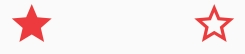
# IconTheme
统一设置多个Icon组件的样式。
Icon组件的图标大小和颜色在默认时会继承父级的IconTheme组件所提供的样式,因此当多个Icon组件需要统一风格时,与其单独设置每幅图标的参数,还不如直接在它们的父级中插入一个IconTheme组件,定义默认样式。
# 1. 用法
IconTheme只需传入一个IconThemeData类型的值,其中可以设置color(颜色),size(尺寸),opacity(不透明度)这3项可选参数的任意若干项。
class CustomWidget extends StatelessWidget {
const CustomWidget({super.key});
Widget build(BuildContext context) {
return const IconTheme(
data: IconThemeData(
color: Colors.red,
size: 48,
),
child: Row(
mainAxisAlignment: MainAxisAlignment.spaceEvenly,
children: [
Icon(
Icons.star,
),
Icon(
Icons.star_border,
),
],
),
);
}
}
2
3
4
5
6
7
8
9
10
11
12
13
14
15
16
17
18
19
20
21
22
23
24
# 2. 合并与继承
Icon组件的默认样式是由最临近的上级IconTheme组件所提供,因此当遇到多个IconTheme组件嵌套时,只有最近的那个样式会生效。
如需要新的Icon组件继承上级已有的默认样式,则可以借助IconTheme.merge()构造函数进行合并操作,而不是重新开始。
class CustomWidget extends StatelessWidget {
const CustomWidget({super.key});
Widget build(BuildContext context) {
return IconTheme(
data: const IconThemeData(
color: Colors.red,
size: 48,
),
child: Row(
mainAxisAlignment: MainAxisAlignment.spaceEvenly,
children: [
const IconTheme(
data: IconThemeData(
color: Colors.blue,
),
child: Icon(
Icons.star,
),
),
IconTheme.merge(
data: const IconThemeData(
color: Colors.blue,
),
child: const Icon(
Icons.star,
),
),
],
),
);
}
}
2
3
4
5
6
7
8
9
10
11
12
13
14
15
16
17
18
19
20
21
22
23
24
25
26
27
28
29
30
31
32
33
34